|
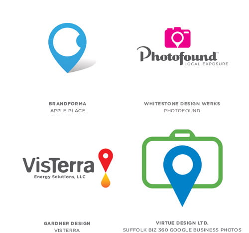
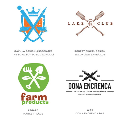
Today we are introducing for your attention the annual report on trends in the world of logo design, which over the last ten years has been written by Logo Lounge. Logo Lounge is an online database that contains more than 200,000 logos. We hope that you will use this report, passing the seen through the prism of your own perception as a starting point for creating logos this year. HereAn icon in the shape of an inverted drop is an easily recognizable symbol for the generation that is accustomed with navigation using GPS navigators. A pin on the map shows the route to your omnipresent digital me. This symbol quickly blended into the icon dictionary, replacing a cross, an arrow, and a dot on the map. CrossedUsually graphic elements are placed in each of the four section formed by the intersection of any objects. This may be the initials of the customer, year of establishment, name, crown, and other symbols. Kitchen utensils, tools, sports equipment and so on are used as crosses. X-shaped symbol implies certain sophistication, even if it is a pair of crossed wrenches. WaveA wave in the logos is a symbol of movement; controlled, rather then rapid.
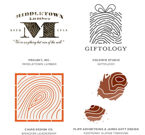
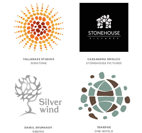
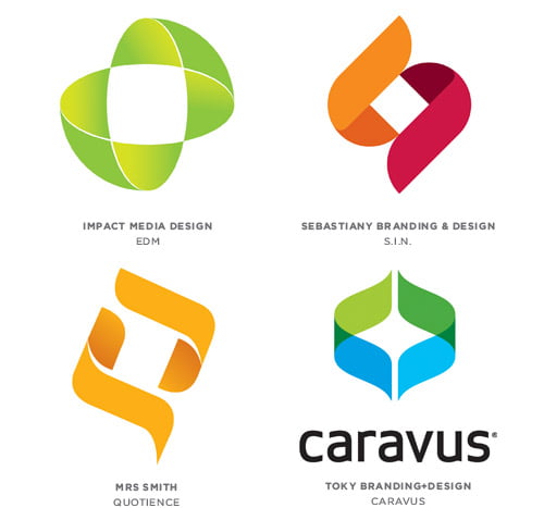
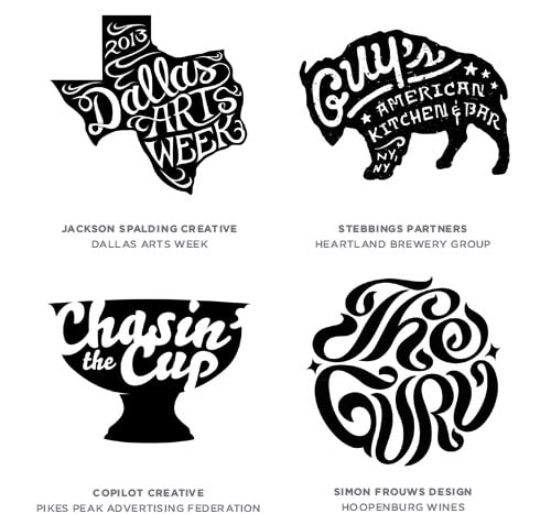
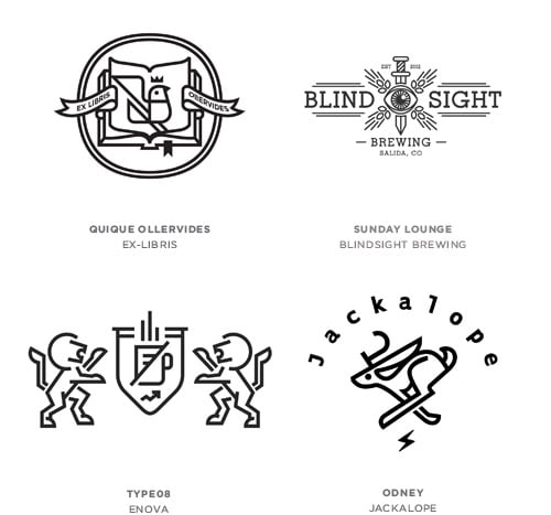
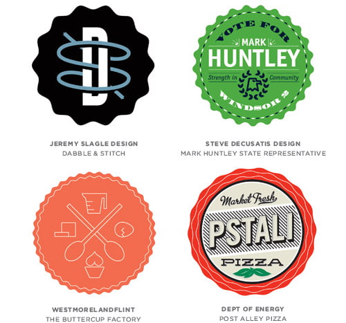
MoleculesThis group symbolizes precision and accuracy - "everything in its right place". The circles connected with lines can represent a big business which elements are working in harmony and unite together in order to support business objectives. Nature MarksFingerprints, annual tree rings or a site map are symbols that speak for personality and ability to meet the unique needs of the customers. MembraneUsually logo patterns consist of simple geometric shapes — points, squares, and lines. Recently, however, irregular shapes have become more commonly used, which give the logo a more organic look. This is similar to the cell membrane that consists of the similar blocks. FormulaThis type of logos shows the equation of ingredients, the combination of which tells a certain story to a customer, offering to bring them together and make conclusions. The elements represent a vertical or horizontal sequence. Logos of this group also symbolize simplicity, as if trying to say to the consumer "it's not the rocket science to understand." BracketingNo matter how different the symbols are, the connective tissue is a white negative space between them. Usually these are two identical elements that create a square or rhombic space in the middle of the logo. This reminds of two brackets with a unique design. Both parts make up a whole and create something more important in the central part. Try to delete one of the pieces and the effect will be gone, but when compressed together they cover one of the biggest products — potential. The consumer is able to dream and fill the gap with what the best suits his or her purposes. EyeletIt is quite a lot of fun to track the path of the lines in such logos. This style transfuses a sense of flow and flexibility. Unexpected turn leads to a problem solution. If you were given enough rope, I have no doubt that you would create your own logo. These are friendly symbols showing the way from the beginning to the end. SlashThe slash has a lot of meanings, but is most often used instead of the word "or," that means one of the two options. In a visual sense, it allows you to unite or divide the concept and the subject. Slash gives you a lot of solutions as well as the @ symbol, which was used a few years ago. Because of its barely distinguish nature, the slash is more convenient and will be used much longer. WrittenWritten style was developed this year. And it was recognized as there appeared a huge number of logos with the hand-written effect. The more I study this category, the more apparent becomes the usage of line, which is located inside the semantic form — the silhouette that finalizes the message. Man-made aspect of logos conveys care and attention to detail. Line CraftProbably the most obvious trend of this year is aesthetics, beauty and reserved elegance. The idea of creating logos using outline stroke alone is not new. However, the presence of different nuances makes the style look modern. Most often black and white is used in such logos, sometimes color outline is used. BadgesThese logos resemble a beer bottle cap. The edges of the logo have wavy edges with sharp or rounded corners. Sophisticating content makes it interesting. The shape is also associated with the Gold Seal, which means the formal approval.
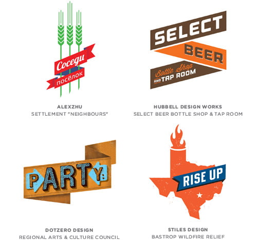
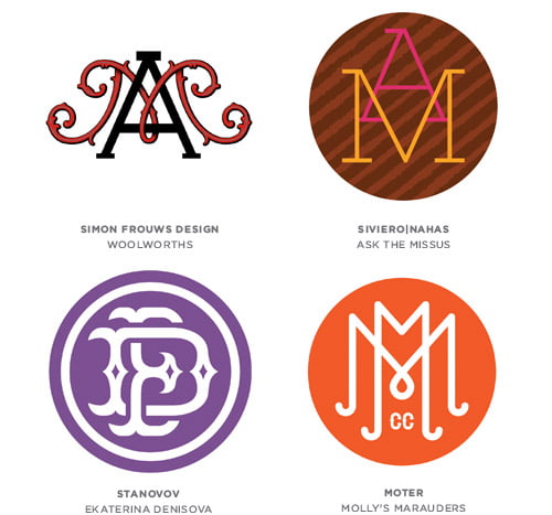
BannersThis theme is played by designers for several years. What used to be encountered in the packaging and web design can now be found at the place of the logos. Usually banners have sharp bends with up-slope direction to the right and italic type. They can be used separately or together with other graphic elements. MonogramsThe art of self-aggrandizement continues to live on, although the first mention of the monogram refers to the year of 350 BC. Monogram renaissance appeared in the mid-18th century, when the family coat of arms gave way to more democratic grounds. There is a certain aura of elegance and formality around such logos in the form of a monogram.
Also I suggest you look at the latest work of designers studio
MadPencil + Vectorboom. I think these guys are creative sensitively
catch trends and the latest trends of the design world.
|