|
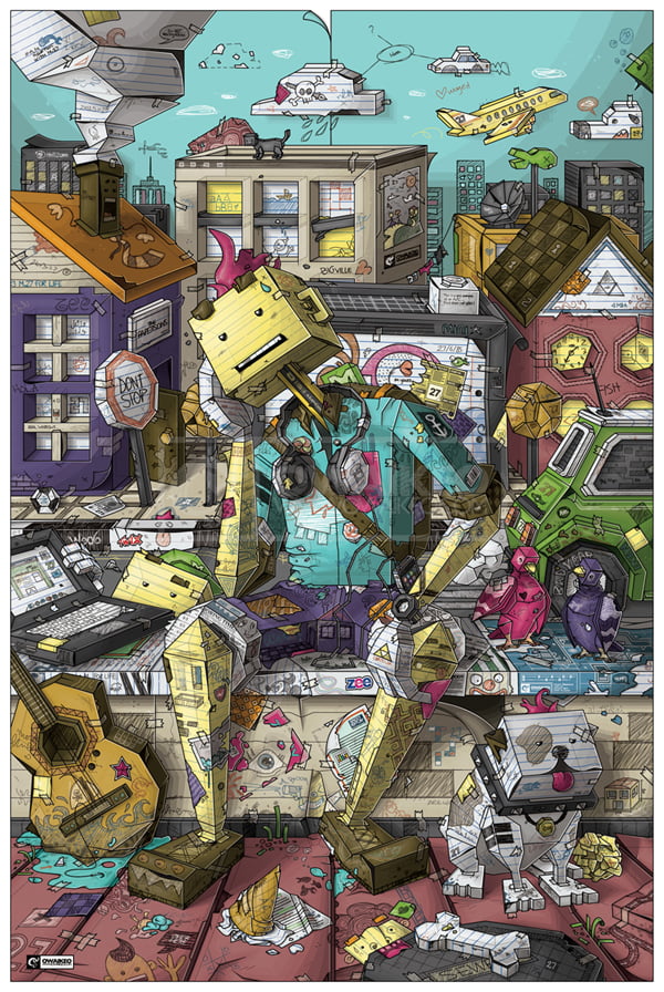
Final Image Preview
This walkthrough is intended for those interested in knowing how I create my art. It is quite detailed as it contains almost everything ( not quite ) I go through while creating this piece of artwork and similarly with previous artworks. Before I start I'd like to point out to those who constantly bug me about my art and say that I spend too much time and that they can create it in just a few days, well .. GOOD FOR YOU. If you think so then you are forgetting that art involves more than the art itself, it is a process. It involves creativity, constant thinking, patience, hard work and many other things. Because I spend too much time on my work, I never intend to take my art and make it commercial, I simply create art for the sake of it, I never intend to create such art for clients as it consumes so much time.
Now that I have got that of my mind, lets start of with the basics:
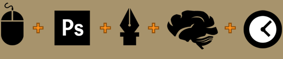
I use an Apple's mouse, Photoshop, the Pen Tool on photoshop, imagination and lots of free time. I use Photoshop because I'm used to it and I dislike Illustrator. I know I can stretch an artwork as big as I want but seriously I never plan to hang my art on a skyscraper. There isn't more to illustrator that will make my process any easier.
Over the past years I kept finding new ways to improve my style and so far these steps below follow my recent improvement on the style:
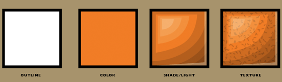
As can see, every object has a closed outline (meaning point A goes in different directions then connects back to point A again) and all outlines are created in a solid black color. This outline is then filled with a solid color (I do not use gradients) then I shade it and that step takes pretty much a long time. A basic shape takes 3 main shades in order to give it that vector feel. Similarly, the lighting is pretty much the same thing, but goes for lighter colors. Finally for some objects I use textures, and those are made by creating little black shapes and they are then placed over the a given object. I don't use images or anything outside Photoshop, its just the pen tool . Therefore, as an example, even a little drop of water that you can barely see on my artwork, has an outline, base color, shades, lights and probably texture.
Now that this done with lets start with the artwork :)
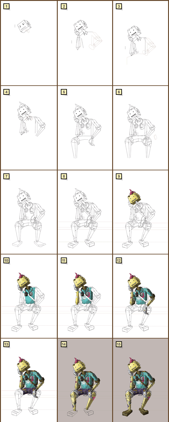
This artwork started with pointless scribbling as I was browsing the internet. I usually have a pile of papers next to me just in case an idea pops. However, with this artwork I was just scribbling and not knowing what the heck I was doing. After a little while, I was like "why not make a guy made out of paper?" and so I had this idea that his face would be made of lined yellow paper, and so this artwork was born.
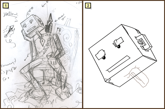
When I finally made my mind, I started with rough outlines on photoshop, and I was extremely hopeless, it was not going well, this guy looks like a failure, but I kinda forced myself, because I'm sick of using celebrity references and I decided to go with this 100% reference-free artwork.
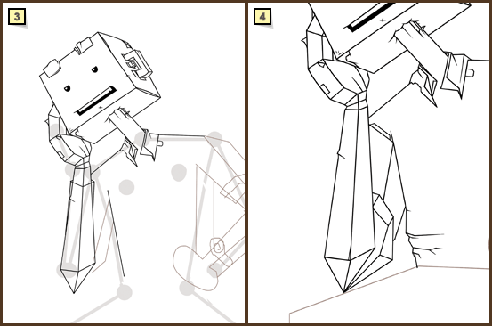
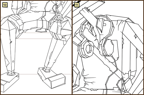
I have never taken any art classes and because I lack knowledge of a human's anatomy I struggled very much creating this paper guy. I kept looking at my arms and how much different they are from the thickness and length of my legs, it was an ongoing process that I had to stop working on it because it made me go nuts. The big gray lines and circles were created as a plan and indication of length and position of arms and legs.
Initially I was thinking of having the neck as a straw but later decided to make it into a pencil instead. In this step I was experimenting with the arms and folds. I tried as much as possible to make this paper guy a possible figure, as in he is not built as this position but rather built standing and later he sat, which means he isn't a sculpture but he can move. Of course that wasn't easy and I did not entirely succeed.
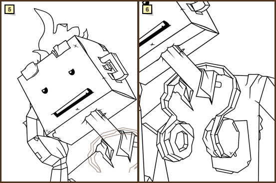
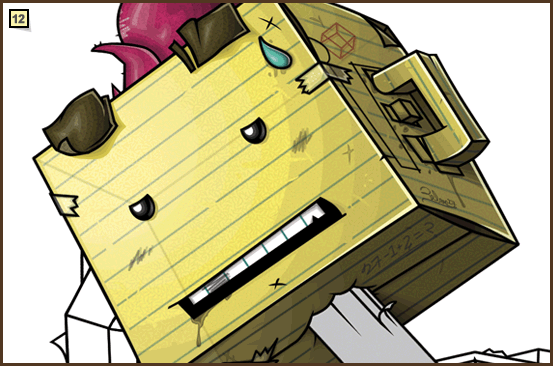
Bold was not very cool and it was time from some hair. It had to be simple since he has a gigantic cubic head, spiky is the way to go.
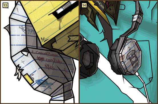
As an asset that goes along with a this sort of character, are large headphones. I had many ideas for it but decided to make it out of paper as well, It was a challenge as I had to make those headphones look like paper and not be too detailed.
Human hands would have looked not right, so I went with simple ones matching the cubic look of the character. Four fingers seemed fine, again since I don't know anything about the human anatomy making hands was hard!
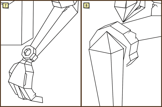
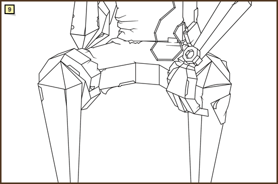
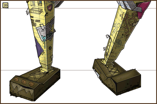
For the legs I had to go with folded pants because having them all the way to the bottom might make the knees look a bit not flexible, plus I needed to show some more yellow paper skin to create a balance.
I carried on with this character even though I don't have a very clear idea on what or where I'm going. I wanted the character to be centered in the image, but being in the middle makes any character or object lack dimension, so I had a problem with the legs, I wanted them to be apart and spaced but as you can see it looks dumb, so I kept playing around and got mad, and closed photoshop (happends a lot!)
I found a solution! I bent the leg and moved it slightly backwards and it seemed to work, specially after adding those paper shoes :)
Since I love detail, I felt a bag pack is needed to add more stuff on this guy and so I did. Although I was struggling to decide, I kept hiding and unhiding the layer and its quite frustrating. Detail comes with consequence, if i don't like a little thing I just can't let it go, I have to fix it, and that consumes time, a lot of time.
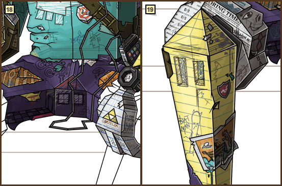
 Color! Now before you start thinking that I might have skipped a few steps, refer to the style and process back on page one. The base color is yellow, I added 4 shades and 3 lights. For the lights I used gradients to make it more smooth. I then textured it using little shapes I made and lined it as if it was real paper. Now there are other tiny things like scratches and smudges, and they are all derived through the same process. The tapes as well, they are consisted of line art, 3 layers of shades, (no lights) they are replaced with little dots representing light. I know Shadows are not even seen in real life for tapes but in my art it is necessary because it creates this sort of attachment with the "taped-with" object and in this case it is this face.
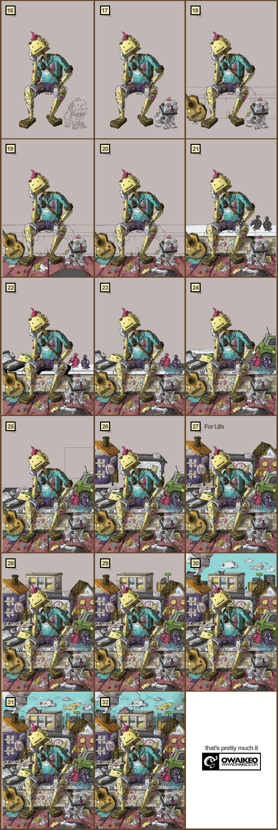
I had several issues with color, since this piece is going to be colorful, I had to study and experiment with colors and see what is most fit. Sometimes fit colors seemed ugly after coloring other parts, so I went back and changed them. Finishing one object does not mean its done unless everything else is done
I started with the coloring with the hand and again it follows the same guidelines mentioned earliar. I did not make the the white paper really white, I made it a bit grayish in order to give it more depth. Since this is paper, I did not want it to be empty, I wanted it to appear as used paper which later turned into this guy and in this case he's got some grocery to do, beans, corn flakes and milk.
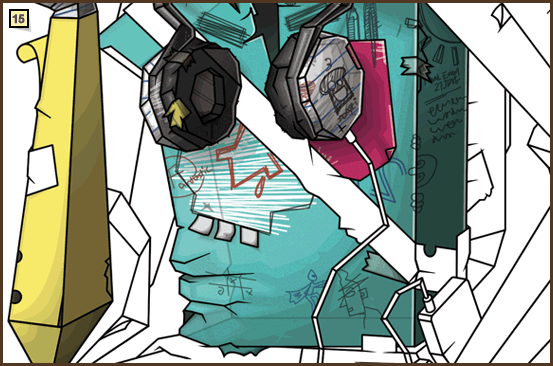
I moved on to the collar which as you can see has pink paper fallen on it from the dudes "pinkish" hair as well, so its not a pro making this paper guy, it's some dude making a clumsy paper guy. I went for the headphones and it was quiet a challenge as the selection of colors was tough as well but turned out fine afterall. Lastly is that blue T-shirt in its early stages, you can actually see the shades still in the process and I hope that gives you an idea of how LONG this thing takes.
Using the same process, I carried on with the arms and Shirt. At first the Shirt was irritating, at times it seemed flat and sometimes it felt too detailed. I kept experimenting with textures in order to give a paper feel.
I use the same texture (that I made) for white and yellow paper, the rest of papers such as blue, pink, brown, etc have a different texture as they are thicker. Because this is paper, I wanted it to be see-through, but that comes with more problems because I am unsure what the background will be colored or even what it is made of, so I use this technique of creating lines, solid black and lower the opacity and you get a 3rd dimension for the artwork, and I add a white layer and lower the opacity from the light source in order to give this 3rd dimension more depth.
 It was time to color the other arm and hand. I followed the same process but of course in order to make it look and keep this interesting factor, I make new things. In this case, the yellow arm has white paper on it and if you look closely its a map. I really wanted to make this a sorta naive artwork, as you might have seen in my previous works, I like to make things broken and out of place, there isn't anything interesting in a regular jar, but if you break it, there a whole lot of art to do, the breaking is an art within itself.
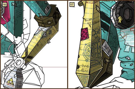
Going back to the first arm, I gave this guy a tattoo made of blue pen and a few other scribbles. The blue T-shirt has white little pieces of paper and again that indicates first that I love detail and second that who ever made this is not a pro.
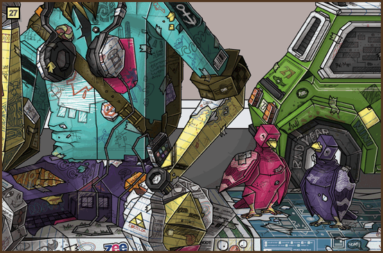
Pants! I encountered many hard decisions making this thing, COLORS are not easy. Since this guy has a kinda blue T-shirt, it will be stupid to have jeans nor I can use black because it's too dark and leaves no room for my scribbles. So after many heart attacks I went for Purple. Colored it, then started adding new stuff. And that iPhone really took a long time to make, I even scribbled the app icons, and yes the calender icon says "27".
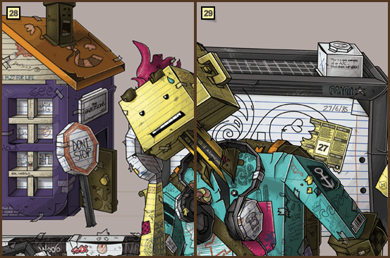
Like the arms, the legs followed the same stages. I have made this piece of paper on top as if a child has drawn it. The problem is that it is too detailed and drags all your attention to it rather than focusing on the big picture. Making detailed art is not easy because I have to make sure it looks good Zoomed out and Zoomed in, and this little drawing from a distance just look bad.
After finishing both legs and the rest of the scribbles and stickers, I went for the shoes. I don't think I really had problems with the shoes because I liked the shape of them, and there wasn't much to do. You might notice some wet looking areas and that is supposedly just glue and at the same time I wanted to give this feeling that this guy has walked on a bit of water, not too much though otherwise the whole thing would have collapsed.
It was time for a little sidekick, and because I never created dogs before here goes one. I started googling "Dog" and looking at several dogs and studied their features and went on photoshop and created the lineart. Of course this was not like BANG and I got a lineart. I kept deleting and recreating etc and that took days, as I said, I can't move forward if a little thing bugs me. As you can see he does not have a nose, I thought making it as scribbles on the paper would be more creative. Then I colored, the same way I colored the yellow guy.
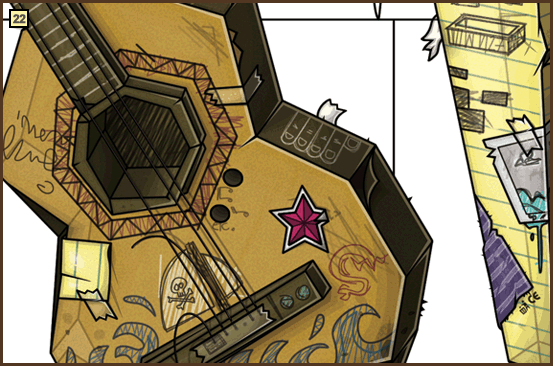
It was time for a guitar, as you know by now I don't know where this is going, but I thought a guitar out of paper material would look cool. I went for that and again, that took days, I had to study the look and details of guitars and experiment with different shapes/takes and once final I started coloring and detailing.
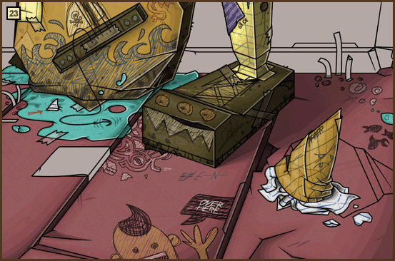
The ground was a challenging part because it contains a lot of details and I had to make sure its looks and blends with the character in terms of shadows and even the weight, you can see the ground is a bit indented under the shoes. Since this is fully paper, I created blue paper representing water under the guitar, in order to make it cool and to support the little visual of the ship, it all made sense. There is this ice cream cone, I wanted it to really to stand out, I wanted the color to be realistic, since I can't have chocolate, I went for Vanilla, which is better in every sense!
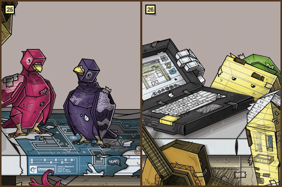
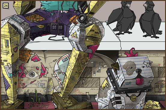 The ground was not done, because I keep coming back and forth because things change when new objects and colors are introduced. I went for that wall thing and tried to do the same process as well. Those two pigeons were hard to create since they are paper and are supposed to look like so. Colors were also a challenge, gray killed them and colorful was too colorful, guess what happened? I closed Photoshop, lol.
The birds got colored and for a change I made a blue print of a house under them. Since I don't know anything about architecture, I googled blue prints and studied how they look like, as in the material, color and lines, then I created my own house.
In order to complement and give this scene more life, I added a kid. This kid was made from scratch, he shares similar features as the other dude but I simply don't copy anything, except for textures. I want each object to be unique on its own. As for the laptop, I wanted a white one, but since the structure under it is white. I had to go with dark gray, as I said, colors are a real challenge.
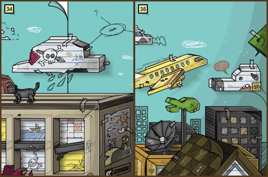
YES its a 27! I started to have a more vivid idea of the whole scene. I made a street and a classic MINI. That was a real challenge to create because of the complexity of the lines and the coloring. The reason I went for the back of the car because I did not want the viewer of the artwork to lose focus of the main thing of this piece, that being the main character. Having said that, one of the main goals of my artwork is for the viewer to look more, perhaps just like Martin Handford's "Where's Waldo". In my case Where's 27, Where's the fish? etc.
I created this house and it involved many challenges such as look and color. I wanted it be a traditional house and so it is, the colors were a challenge specially the windows, I wanted a more colorful one, but because too much color was making it not look paper-like, I went for white lined paper.
Besides the house I made a garage, same thing, the Graffiti-looking thing was not final, I tried different things and tried as much as possible not be too detailed but still detailed.
Another House and Lamp posts.
This building was complicating, since its right behind the guy, meaning in the center of the image, dimension was lost. Although its not realistic, I pretended as if the building is titled just to give it more room and extrude from behind.
I made a building behind in order to give a sense of depth as well as scale of this city/village.
I decided to give Mr. Chimney .... smoke, it made more sense. At first I was experimenting and not sure whether I should have the smoke stretch all the way to the top of the artwork or have the smoke so little. The dinosaur looking smoke was a coincidence, I did not plan it, it sorta went with the flow.
Clouds with a twist, I later split the sky in half as if they are two pieces of blue paper that got attached to each other. As you can see I always want to give this non-perfect feel, I mean if they were perfectly taped/glued, where's the fun in that? and who would notice that they are two papers?
It was time for a blue sky. Everything was going well except that plane. It made more sense to have it white, but almost everything else on the sky was white so I had to go with yellow. I later made a few tweaks for other minor things, including that smoky thing behind the plane, I had it removed.
That's it! Now as you know, I use photoshop and because of that I have to merge layers so the Photoshop can run smoothly. In order not to lose the layers I always "save as a new copy" and keep the layers in separated files. Therefore, this project is consisted of 32 files which you can see how it evolved on the following preview:
This tutorial was created by Ahmed Alrefaie aka owaikeO, for more of his works make sure to visit owaikeo.com
Follow us if you want to be the first to know about the latest Adobe Illustrator tutorials and articles. Vectorboom team works for you!
|