|
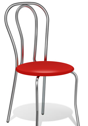
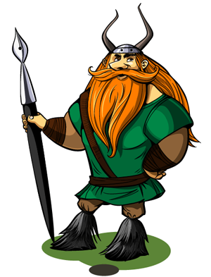
In any graphic design project, the two most common elements that you are likely to come across are drop-shadows and gradients. When used correctly, these visual metaphors are attractive and useful but, when used incorrectly, they can make the whole project appear off skew and out of sorts. This article aims to outline what drop-shadows and gradients actually achieve in our designs and why consistency is vital for ensuring success.
So, what do drop-shadows and gradients actually achieve in graphic design? In short, these visual metaphors allow the designer to create the illusion of space and three-dimensionality in their work. Let’s take a look at how these elements function in the real world:
1. Drop-shadows are created when an object blocks a light source from a surface that is behind it.
2. Gradients are created when one part of an object is closer to a light source than another part (the closer part appears lighter and the farther part appears darker).
Using these elements in design is a way of mimicking the real world and making the project seem more relatable to its intended audience.
As mentioned above, when drop-shadows and gradients are used correctly they can make a graphic design project appear for more beautiful and give it that little extra touch it was lacking. So, how do you use these elements correctly to ensure that your project is a success?
1. Don’t use these elements at all. This is one possibility that is very rarely taken onboard by designers, but it is the surest way to prevent yourself from making mistakes in their execution.
2. Save the inclusion of these elements to the end. Once you have finished the project and it looks nice, then you can experiment with drop-shadows and gradients to see if you can improve the appearance.
It is important to remember that you should never use either of these elements as a way of improving your graphic design — they should only be used to enhance something that is already quite attractive.
There is no way, however, to control how drop-shadows and gradients are used in graphic design — at the end of the day, people are free to do as they like and to use elements in whatever way they see fit. web Designers should also note, however, that they cannot control how their visual metaphors will be interpreted by their audience, and failing to use drop-shadows and gradients correctly could hugely affect this.
Follow us if you want to be the first to know about the latest Adobe Illustrator tutorials and articles. Vectorboom team works for you!
|