|
If you’re the kind of person that regularly attends business meetings or networking events, chances are that you’ve seen more than enough business cards to last you a lifetime. The fact of the matter is that while there’s certainly no shortage of business cards out there (as they’re pretty much a staple requirement for any business), the majority of them aren’t anything special at all.
In fact, many businesses create business cards from bog-standard templates, which are fine if you’re on a budget, but making use of these will always mean that the design won’t be unique to your business.
Many businesses also overcomplicate their business cards, filling them with unnecessary information, imagery and flamboyance.
The truth is, minimalism is usually the way to go with business cards, as a well-designed business card should be clear; it should also let the recipient know what your business is all about.
Here are a few of the most inspiring minimalistic business cards we’ve come across:
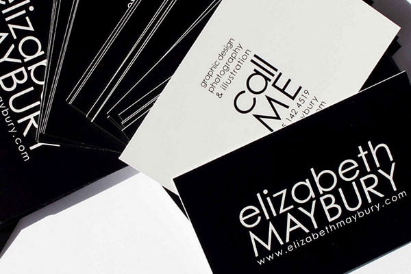
Elizabeth Maybury designed these stunning business cards for her graphic design, photography and illustration business, and they’re certainly minimalistic. They don’t contain any imagery whatsoever, just text; and nor do they make use of any colours other than black and white, which helps to keep things clean and focussed. Despite the minimalistic nature of the cards, Elizabeth still packs in all the information a business card needs to have, and the inversion of the colours (on each side) helps tie both sides of the card together in a consistent manner.
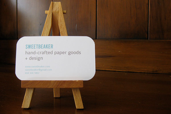
Sweetbeaker is a handcrafted paper goods and design company with some absolutely stunning business cards. You can see that once again, these cards are predominantly black and white, although they do make use of a stunning light blue colour, too. Design-wise, there’s not much to these cards at all, and the cards contain only the bear minimum amount of information. However, the rounded edges of the card add a nice touch that really helps them to stand out.
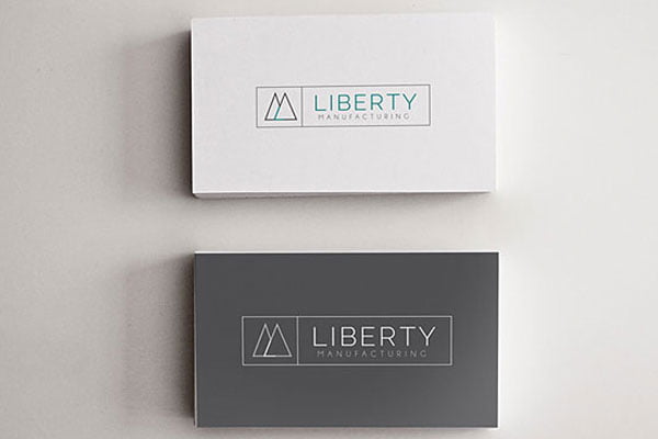
Liberty Manufacturing is yet another business that has taken the minimalistic nature of their business cards to the extreme, and also yet another company to use the white, black and blue colour combination. There are actually two different versions of the card: a solely black/white version, and a black/white/blue version. The two cards are very similar, but this is a good illustration of how utilising only black and white helps to create that premium, upmarket feel to any business card, as the white/black/blue version looks slightly less “high-end”.
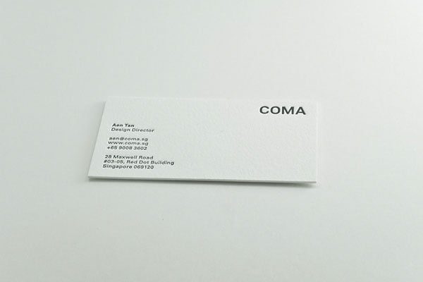
Coma shows just what you can do with such a small amount of design here, as there’s almost nothing to these cards at all. These cards feature nothing but a small amount of (relatively small) text, along with the text-based logo of the business in the upper right corner. However, the reason these business cards don’t look bland or boring is down to the quality of the paper used, along with the letterpress printing technique (carried out by Dolcepress.com). Remember, it’s about quality over quantity: that’s always the way to go when it comes to minimalist design.
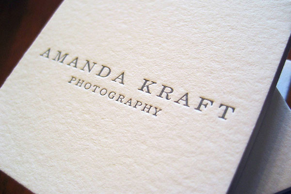
Amanda has followed the same idea of quality over quantity here, as she’s opted for nothing more than her name and occupation to be printed on high-quality, matte cardboard. She’s also used the letterpress printing technique (much like Coma) to give her business cards that premium look and feel. Amanda has also chosen to print the cards in a slightly unusual square shape, rather than the traditional rectangular shape. Again, this helps Amanda and her business to stand out in a sea of bog-standard rectangular cards.
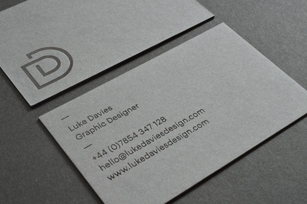
Luke Davies is a graphic designer with exquisite taste, as you can tell from the sheer quality of his business cards. Clearly, these business cards are relatively monotonic, as they feature nothing but a grey background on both sides, highlighted with only black text, but it works well. Luke has also made use of glossy black foil for the text, which helps to create a subtle yet eye-catching look.
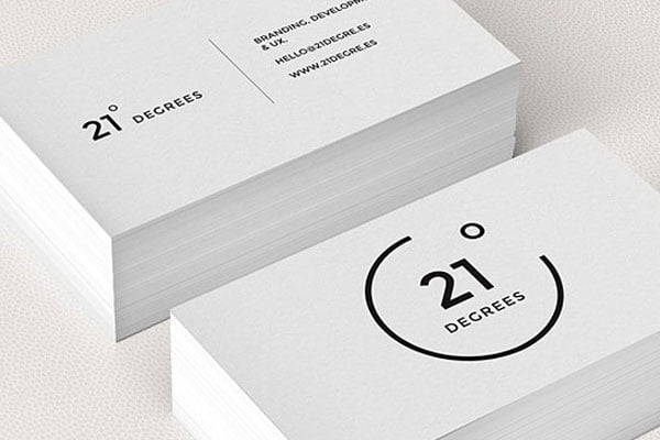
21 Degrees business cards are an absolutely perfect example of what great typography combined with minimalistic design can do. You’ll notice that the business cards are predominantly white (as are most minimalistic cards), meaning that it’s the typography that does all the talking. By making use of beautiful, uppercase typography, the company shows that they mean business in the subtlest way possible. The business cards are in no way in your face or brash, yet they invoke a sense of trust and also give a glimpse into the design philosophy over at 21 Degrees.
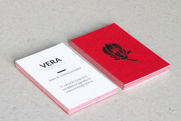
Vera Dobrescu runs Grada, a small landscape company with more than 20 years experience in the industry. These truly minimalistic business cards are probably not what you’d typically expect from such a company, as there’s no sign of greenery or landscaped gardens in sight. That isn’t a problem though, as these business cards come across as much more elegant because of it. The rear side features a simple flower illustration, while the front lets you know who runs the company, what the company is about, and how to contact them. Remember, a business card only serves as an introduction, so there’s no need to showcase your work/portfolio on a business card; the potential customer/client will visit your website if they really want to see that.
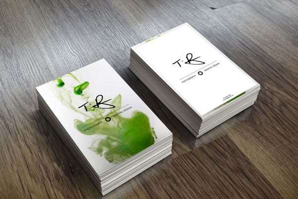
T.B. Photography is a business that was started by Australian graphic designer, Tyhe Reading, who created these business cards during his third year at university. The idea here was to keep things simple, while also showcasing the photographer’s versatility in a unique manner. Each business card makes use of one single image (green smoke, in this case), which is overlaid with a simple logo and information about the business (i.e. photography and graphic design). On the rear side, things are even more minimalistic, with a block white background taking centre stage. The contact details are kept out of the way at the bottom of the card, where they’re written in a small, non-intrusive font.
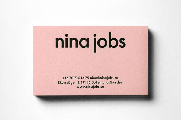
Nina Jobs is a Swedish designer who has taken the concept of minimalism with these cards, while also managing to invoke her own quirky personality into them (quite an achievement). You’ll notice that these cards are extremely simple, and once again, it’s the typography that does a lot of the work. Her name (Nina Jobs) is written in large, bold, black type, making it the focal point of the entire business card (this makes sense, as she is a freelance designer, so the business is all about her). Below that, you can see all of her contact information written in much smaller type. The bright pink background along with her choice of typography gives you a glimpse into her personality, without the need for straplines or imagery.
Author Bio:
Joshua writes for a number of design-related websites, and typically writes on the subject of minimalism or essentialism. He’s always been passionate about design, but never attended design school; he prefers to be guided by his own mind and ideas.
|